Athena Visualizations enable enterprise teams to transform raw business data into interactive executive dashboards that provide at-a-glance insights into key performance indicators. Leadership teams can monitor revenue trends, operational metrics, and strategic initiatives through professional-grade charts and graphs without manual report creation. With the Visualization Toolkit, executives gain real-time visibility into business performance through customizable dashboards that combine multiple data sources into compelling visual stories that drive data-driven decision making.

Step-by-step Instructions

1

Prepare your data source

Navigate to Spaces. Upload your quarterly performance data as an Athena Sheet or connect to your existing database containing revenue, expenses, and KPI metrics.
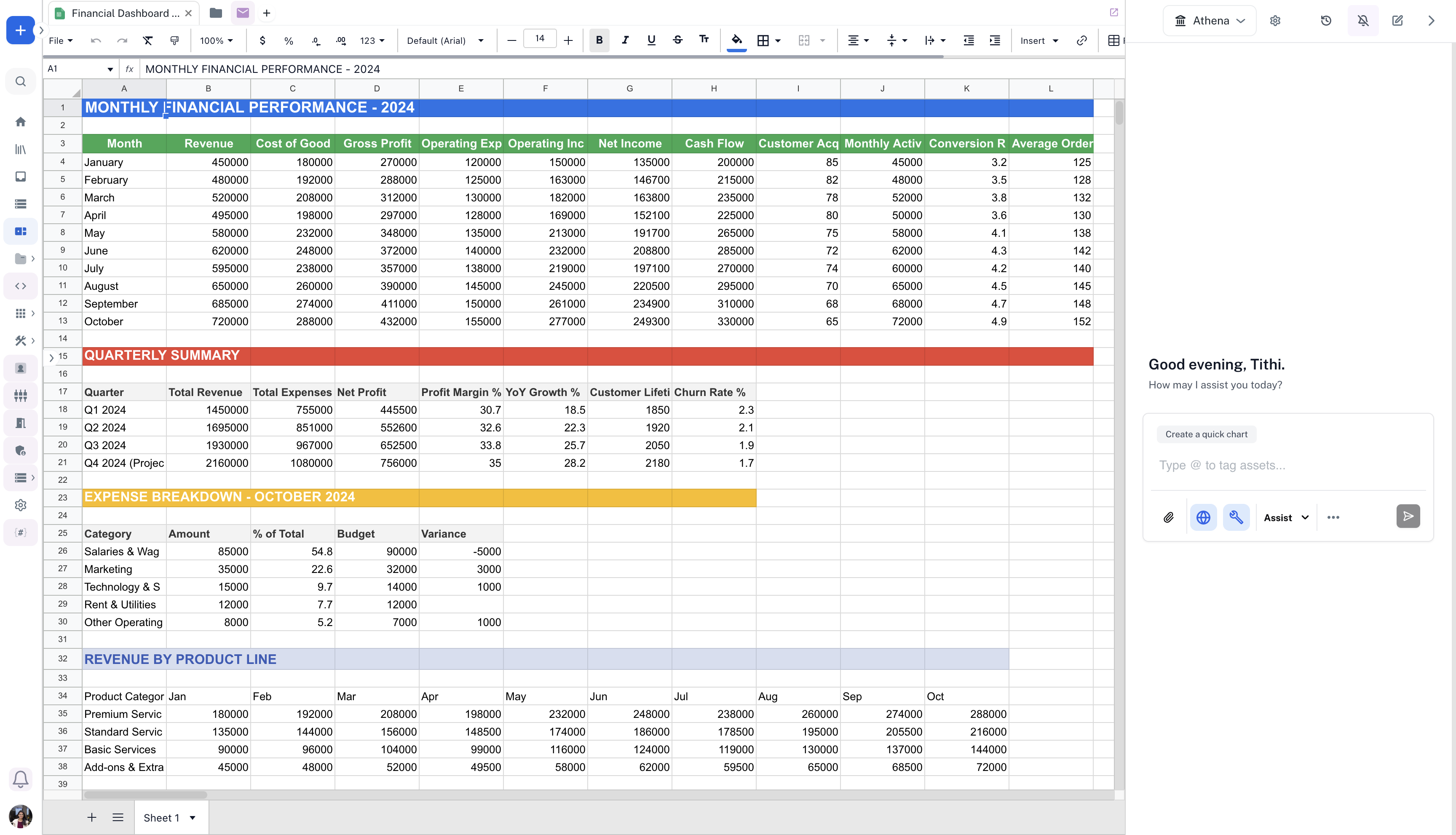
2

Generate visualizations with Athena Assist

In the chat UI, select Athena Assist and enable the Visualization Toolkit. Enter the following prompt and press Enter:
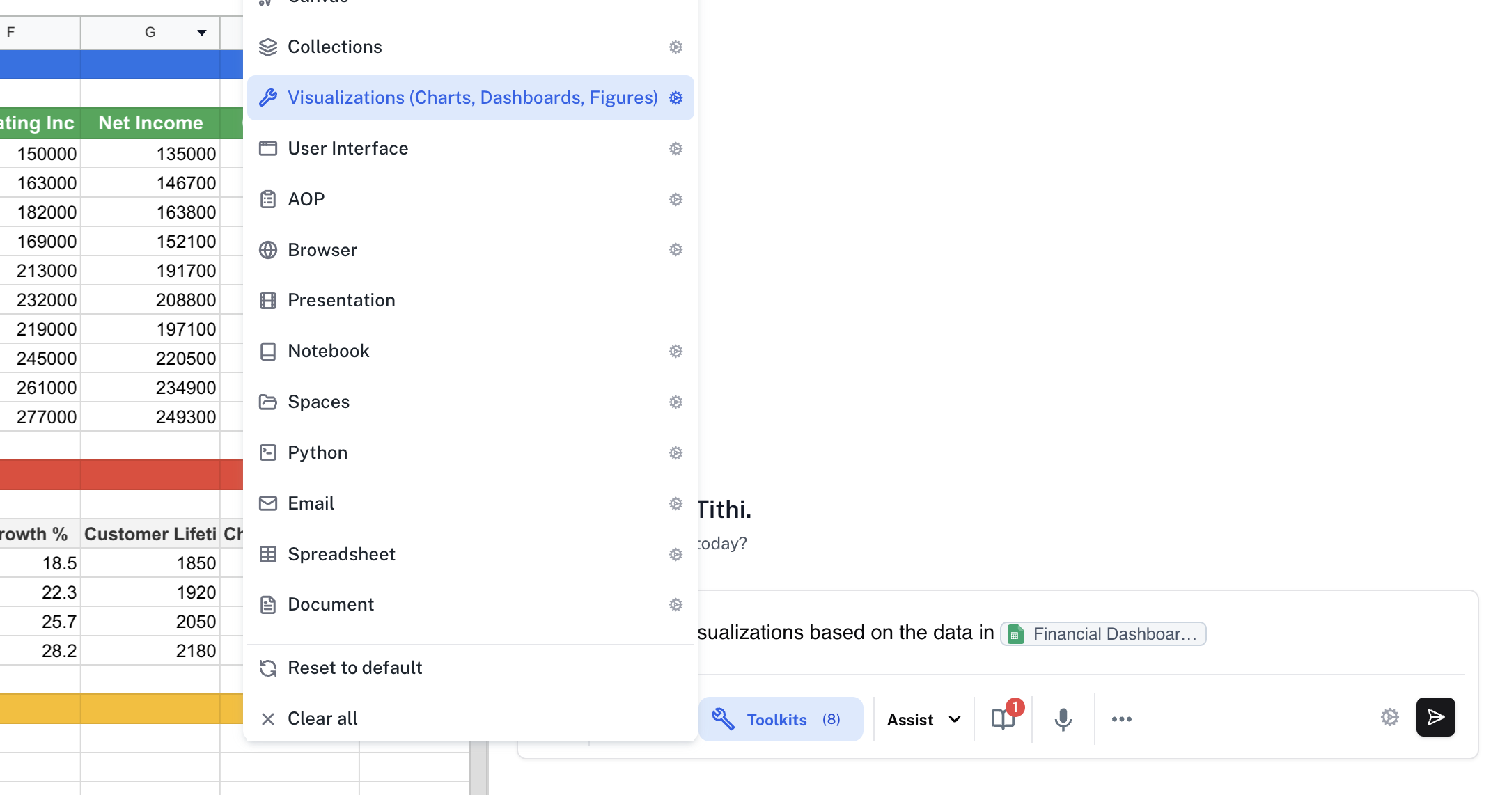
Prompt
Create several visualizations based on the data in @Financial Dashboard Data.
3

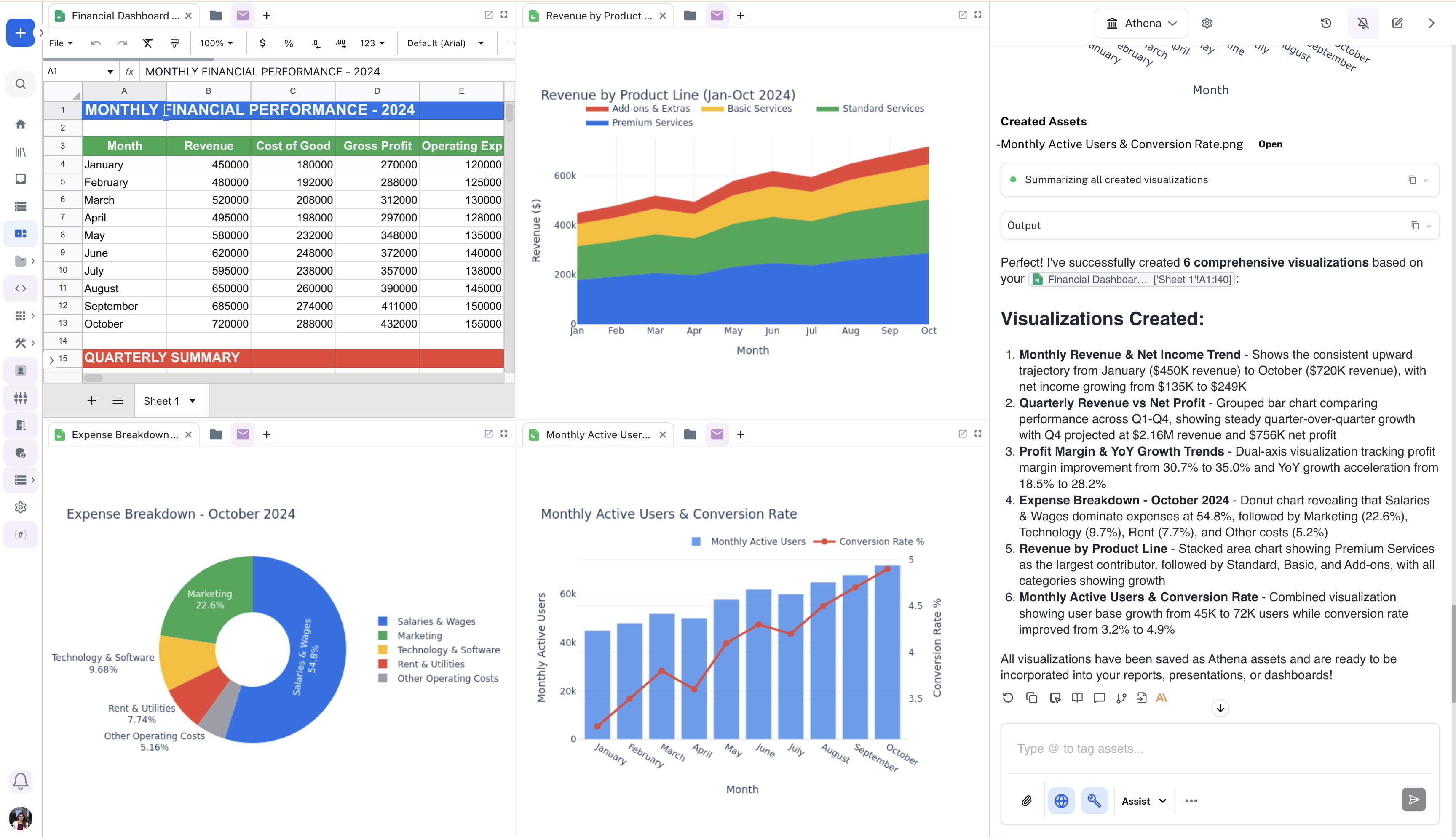
Analyze created visualizations

Analyze the visualizations created by Athena by dragging and dropping them in the Spaces view.